Study 1
Simplify Access to Information
With the increasing emphasis on patient-centered care, ensuring that patients can readily understand and access drug information is paramount. This need stems from both regulatory requirements and the ethical responsibility to promote patient safety and adherence. Providing clear, concise, and comprehensive drug information can significantly enhance patient outcomes, reduce medication errors, and foster a better understanding of prescribed therapies.
To address this need, a leading pharmaceutical company reached out to us to improve their drug information materials. Our initial discussions focused on understanding their current challenges and goals. The company's existing materials were often dense and difficult for patients to navigate, leading to confusion and potential non-compliance. Recognizing the importance of clarity and consistency, we proposed a structured design and template process that would standardize the layout of all drug information documents, but also allowed for each experience to have it's own unique branding in order to stay consistent with the company's many products.
During the design phase, we collaborated closely with the company's medical, regulatory, and marketing teams to ensure that the new templates would meet all necessary guidelines while also being user-friendly. We developed a series of prototypes, each designed to present information in a logical, easy-to-read format. Key sections such as dosage instructions, potential side effects, and storage guidelines were prominently featured, using straightforward language and visual aids like icons and infographics. The result was a suite of drug information materials that significantly enhanced patient comprehension and engagement, ultimately contributing to better health outcomes.
Study 2
Prototyping with a Nonprofit
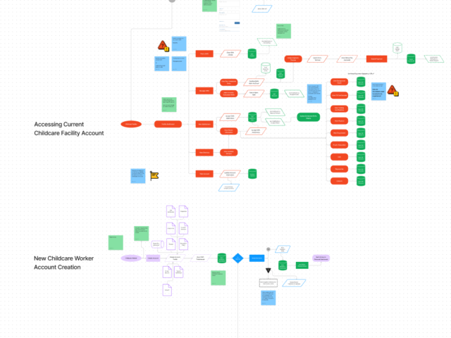
As a parent, it is of the utmost importance to know that the people caring for your child qualified and reliable. An Indiana-based nonprofit wanted to help mitigate the shortage of qualified childcare workers by creating a solution for facilities to easily be able to fill their needs. They brought us their concept of 'rideshare meets childcare' and needed help creating the experiences for both childcare professionals and facilities to be able to connect with eachother quickly and effectively.
This design concept needed to have 2 distinct user flows, so we kicked things off by diving deep into understanding the nonprofit's mission and the challenges faced by childcare facilities. We mapped out how different users, like facility managers, temporary childcare professionals, and the nonprofit's admin staff, would interact with the system. We aimed to make these flows as intuitive and efficient as possible, cutting down the time and effort needed to match professionals with open roles. Flow 1 required getting the childcare workers connected to the platform and having them provide all of the necessary certifications for the state. Once their profile existed they could be contacted by local facilities to help fill in during times of short staffing. The 2nd Flow got the facilities registered and gave them the ability to creating postings for shift openings as soon as they came up, or schedule them weeks in advance.
With the user flows nailed down, we moved on to designing a full prototype. This prototype included all the features needed to support the various user interactions, from job postings and applications to scheduling and communication. We used high-fidelity mockups and interactive elements to create a realistic user experience. Throughout this phase, we kept a constant feedback loop with stakeholders to validate our design choices and make necessary adjustments. The result was a robust prototype that not only met the initial requirements but also provided a solid foundation for future improvements.
Study 3
Information Management
As seemingly everything moves into the digital age, its important to realize the difficulty some industries can face in the shift to the new status quo. In the manufacturing industry, it is not uncommon to see companies with an inefficient system for storing and managing its product data. Unfortunately, this disorganized approach led to significant issues, including conflicting and outdated information across various departments.
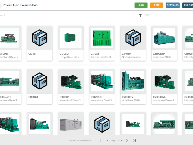
Recognizing an opportunity for a more efficient solution, our team built an information management system into our digital platform to address this issue. We introduced a comprehensive digital solution designed to establish a single source of truth for all their product information. This system centralized their product data, ensuring that every department could access the most current and accurate information from one reliable location. With this new approach, the company could now maintain consistent information and utilize it for a number use cases across a variety of teams within the organization.
The centralized system allowed for seamless updates and ensured that all product information used for catalogs, events, and product sheets was consistent and up-to-date. By only needing to maintain information in a single location, the company drastically reduced the risk of errors and outdated data. This not only streamlined their internal processes but also enhanced their ability to present reliable and accurate information to their customers, while reducing their costs in printed materials which could become out of date just weeks after production.


